Monday 12 May 2014
Thursday 8 May 2014
Feedback Using 'Instagram' vol.2
After we found out about the problem about using a 'too similar' image in both poster and magazine cover, we couldn't decide which one to change so instead we created both new poster and magazine cover and again uploading them to 'Instagram' to see which media product would get the better response. Whichever one got the better response would replace the old one.

Once again we got a very speedy response from our target audience and turned out that the new poster got a greater amount of a reaction. As a result of this experiment, we replaced the old poster with the new one which was chosen by the audience.
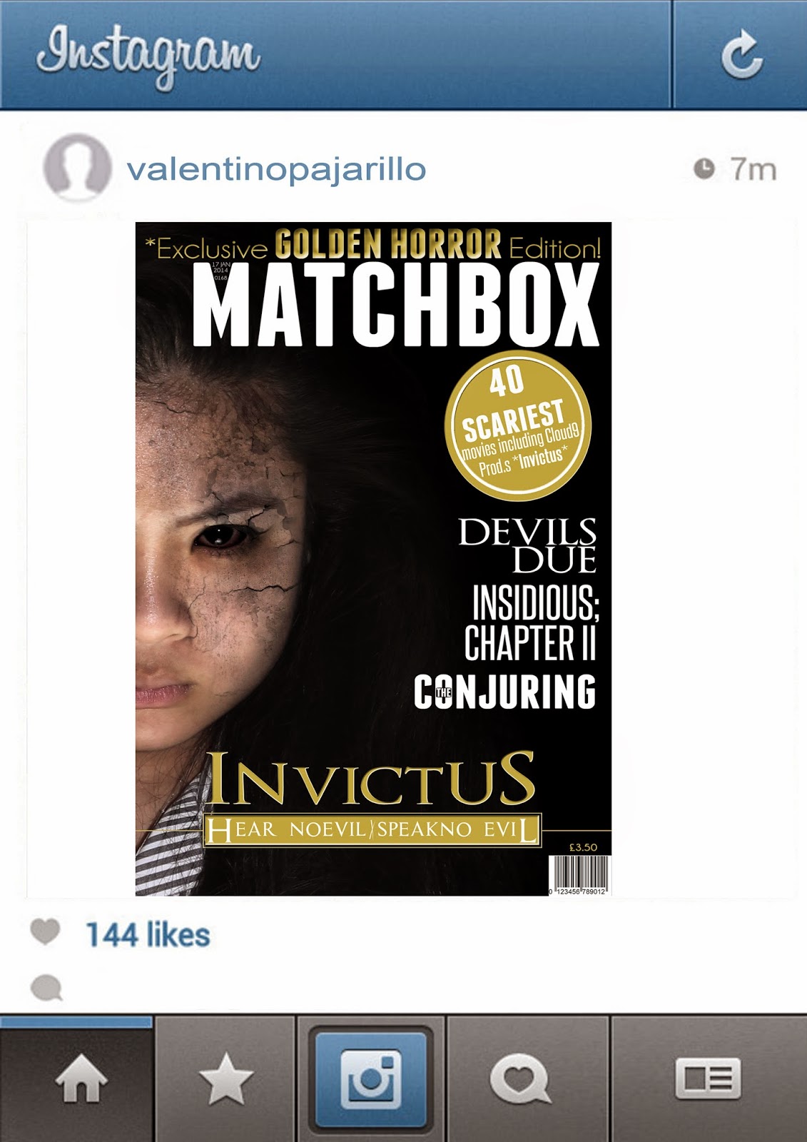
Feedback Using 'Instagram'
After the creation of our first drafts of the poster and magazine we wanted to see how our target audience would react to them using the smartphone app 'Instagram'.


As a result, we got a massively quick response from out target audience with a majority of positive comments.
Photo shoot cuts
During the Post production stage, while we was planning the lay out of the new poster and magazine cover, we where unhappy with some of the qualities of the pictures.


Their are some photos where they picture wouldn't be clear enough to be used for our products as they where a bit blurry. This was unacceptable as our goal was to create a film poster/magazine cover at a professional level and the quality of some of the pictures we took were just not up to standard.
For some of the pictures, the lighting was just off and just didn't suit our genre making the editing and the photo manipulation stage would be harder to do, therefore we didn't use these pictures either as they was not fit for purpose.
Decisions between poster ideas
+draft+2.jpg)
+draft+1.jpg)
During the process stage of our new poster, we was originally going to stick with the idea of the spooky hands covering the protagonists hands, but we didn't want the images to be too similar so we then had to think of a way to show the protagonist slowly being possessed. This is when our main editor 'Valentino' came up with the idea of taking out the hands and putting the grudge effect growing from the area that were originally covered by the hands.
We didn't know if it would of worked as well as the hands so what we did was create both as an unfinished version, and let our target audience decide which they thought was best.
As a result, our audience loved the version without the hands covering parts of her face. some of the audience even commented that it worked even better, therefore we continued to work on the version without the hands on her face.
Question #3
In what way does your media products use, develop or challenge forms and conventions of real media products?

Monday 28 April 2014
Analysing our Teaser Trailer: Things we could have improved
Although there were numerous positives about our teaser trailer, of course there were parts that could be improved.
 During the scene where Jason is shouting "Dios Mios!", we should not have panned the camera to track him because audiences may get confused and think the scene was filmed from a character's point of view when in fact it is not

After the final title we could have increased the volume of on the sound to create a more effective jump scare and catch the audience off guard.

 During the scene where Jason is shouting "Dios Mios!", we should not have panned the camera to track him because audiences may get confused and think the scene was filmed from a character's point of view when in fact it is not
After the final title we could have increased the volume of on the sound to create a more effective jump scare and catch the audience off guard.
We could have also zoomed in on her face to show a close up of the emotion and facial expressions - which convey the unstable state she is in. This is would make the audience uncomfortable and leave the audience feeling curious and hopefully a little scared.
Analysing our Teaser Trailer: Good Points
Creating our trailer proved to be long and difficult, alternating between the time needed to shoot the scenes and editing our footage. Not to mention the use of other softwares such Adobe After Effects to create the titles.

 The use of the montage was effective with the sudden "booming" sounds creating a strong impact with the images. The combination of the sounds and the images also help to catch some of the audience off guard, frightening them. This would classify as a jump scare.


 In our film footage we included visual symbolism of religion to further link our trailer to this theme. For example we have a view of the crucifix hanging on the wall behind Gianne and we can see that this section of the library is labeled 'Religion'. Gianne then moved infront of the crucifix, blocking it from view. This is a sign of foreshadowing and the unfortunate event that is soon to come i.e she becomes possessed.
 Another successful way we linked our trailer to religion through the images of the demons used as a short montage when Gianne opens the book. This might seem unusual at first since demons and evil are not the first thing people think about when it comes to religion They usual think of the opposite, about God, Jesus, divinity when they think of Christianity.

We had a relatively strong opening. Our choice of music and the use of subsonic sounds helped to create a tense atmosphere. The image of the company logo also appeared in syncopation to the subsonic noise and opening of the music.
The use of the montage was effective with the sudden "booming" sounds creating a strong impact with the images. The combination of the sounds and the images also help to catch some of the audience off guard, frightening them. This would classify as a jump scare.
The use of the handheld camera made the trailer more engaging and was successful in creating a sense of realism and unease for the audience. This factor works well with our horror genre.
Using the handheld camera helped in creating unease among the audience, creating a personal experience between the character holding the camera and people in the audience.
The motion of the handheld camera also creates a sense of panic which again puts the audience in unease and helps to build tension.
.
I believe our trailer was very successful in representing the religious aspect of our theme and genre. Having our main character wear a cross which creates religious symbolism and links religion to sub-genre of possession.
.
 In our film footage we included visual symbolism of religion to further link our trailer to this theme. For example we have a view of the crucifix hanging on the wall behind Gianne and we can see that this section of the library is labeled 'Religion'. Gianne then moved infront of the crucifix, blocking it from view. This is a sign of foreshadowing and the unfortunate event that is soon to come i.e she becomes possessed. Another successful way we linked our trailer to religion through the images of the demons used as a short montage when Gianne opens the book. This might seem unusual at first since demons and evil are not the first thing people think about when it comes to religion They usual think of the opposite, about God, Jesus, divinity when they think of Christianity.
Sunday 27 April 2014
Different Image Effects for Magazine
These were some of the different effects we tried on our model for our magazine drafts.
.jpg)
I made different versions of our magazine cover main image applying a different effect and then went out and asked some of our target audience to tell us which version they found best effective or the best looking for our magazine cover. as a result we ended up with a tally chard revealing that the image in the middle was most popular choice.
I made different versions of our magazine cover main image applying a different effect and then went out and asked some of our target audience to tell us which version they found best effective or the best looking for our magazine cover. as a result we ended up with a tally chard revealing that the image in the middle was most popular choice.
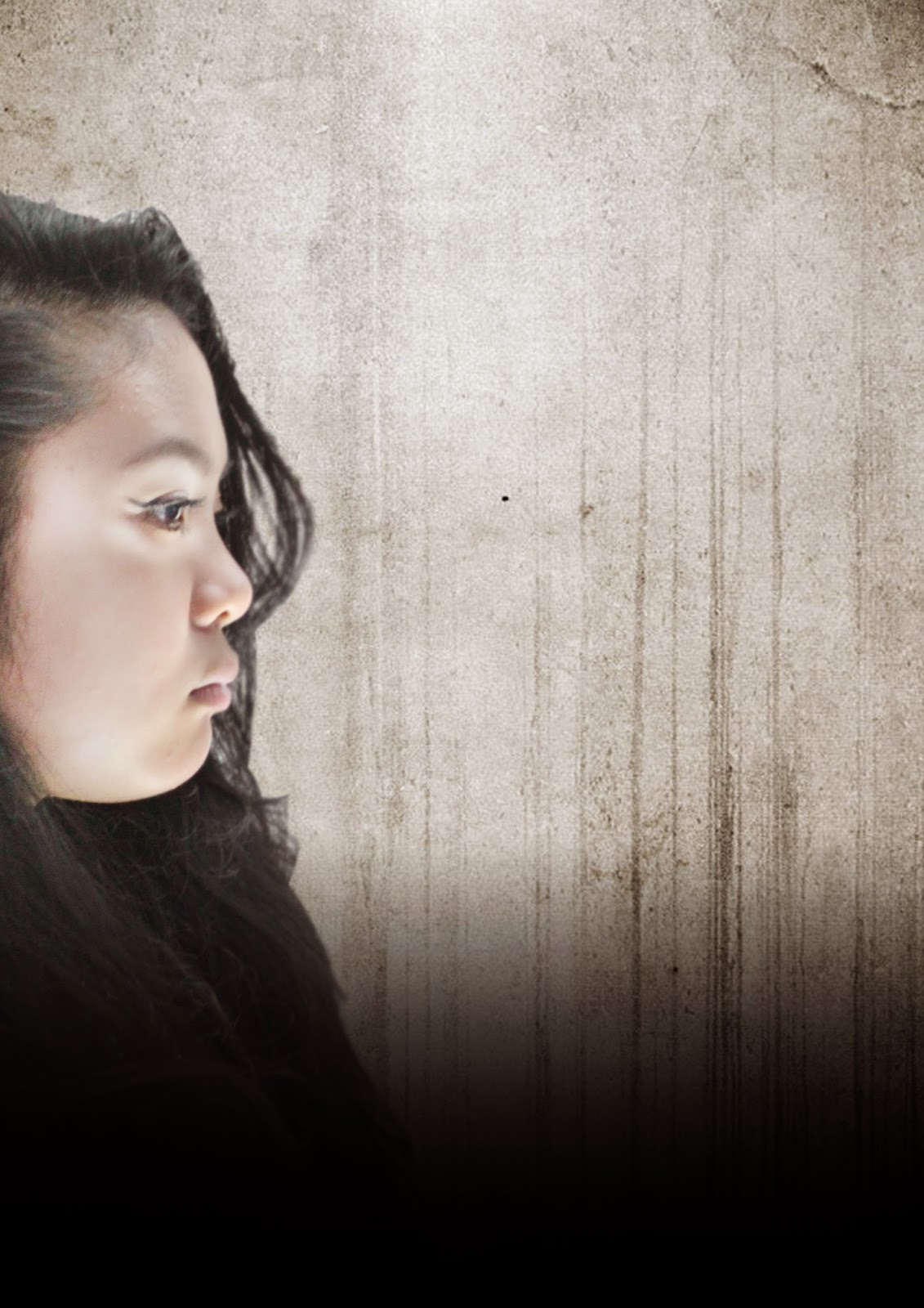
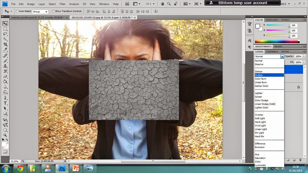
Construction of Scary Effect on Poster
This is a little tutorial on how I constructed the scary image for our main poster.

Step 1;
First of all, what I did was I got the main image of my model and simply Transform (CTRL+T) it which allows me to just resized her and placed her in the position I wanted her to be in on my poster.
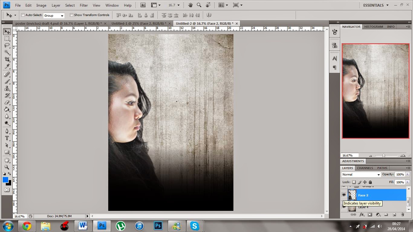
I then used the burn tool to darken certain parts of my models face to make her look a bit scarier. E.g. darken around the eyes.

Step 2;
I then got an image of a grudge texture from Google and resized and placed the image over the area on my model's face where I want the effect to take place.


Then to make the image of the grudge texture look like as if it is apart of my models face, I then changed the layer style from normal to Multiply. After, I then used the Erase tool and erased out all the areas of the grudge effect image I didn't want to give the effect of the cracks on her face are growing around her face.
Step 3;
Lastly, I wanted to play with the contrast and the colour of the whole image to make my model fit in with the back ground and theme of the movie a bit more so I used the 'Curves' Adjustment and made my own customer curves moving them up and down until I was happy with what the image looked like.
Once I was happy with the contrast of light and dark areas of my poster I also noticed that it enhanced the colour on my models face which I didn't like so I then used the 'Hue/Saturation' Adjustment and lowered the saturation of the image.
Friday 25 April 2014
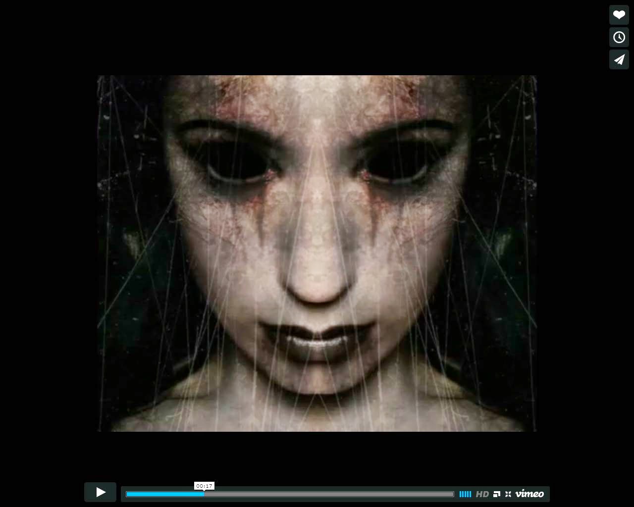
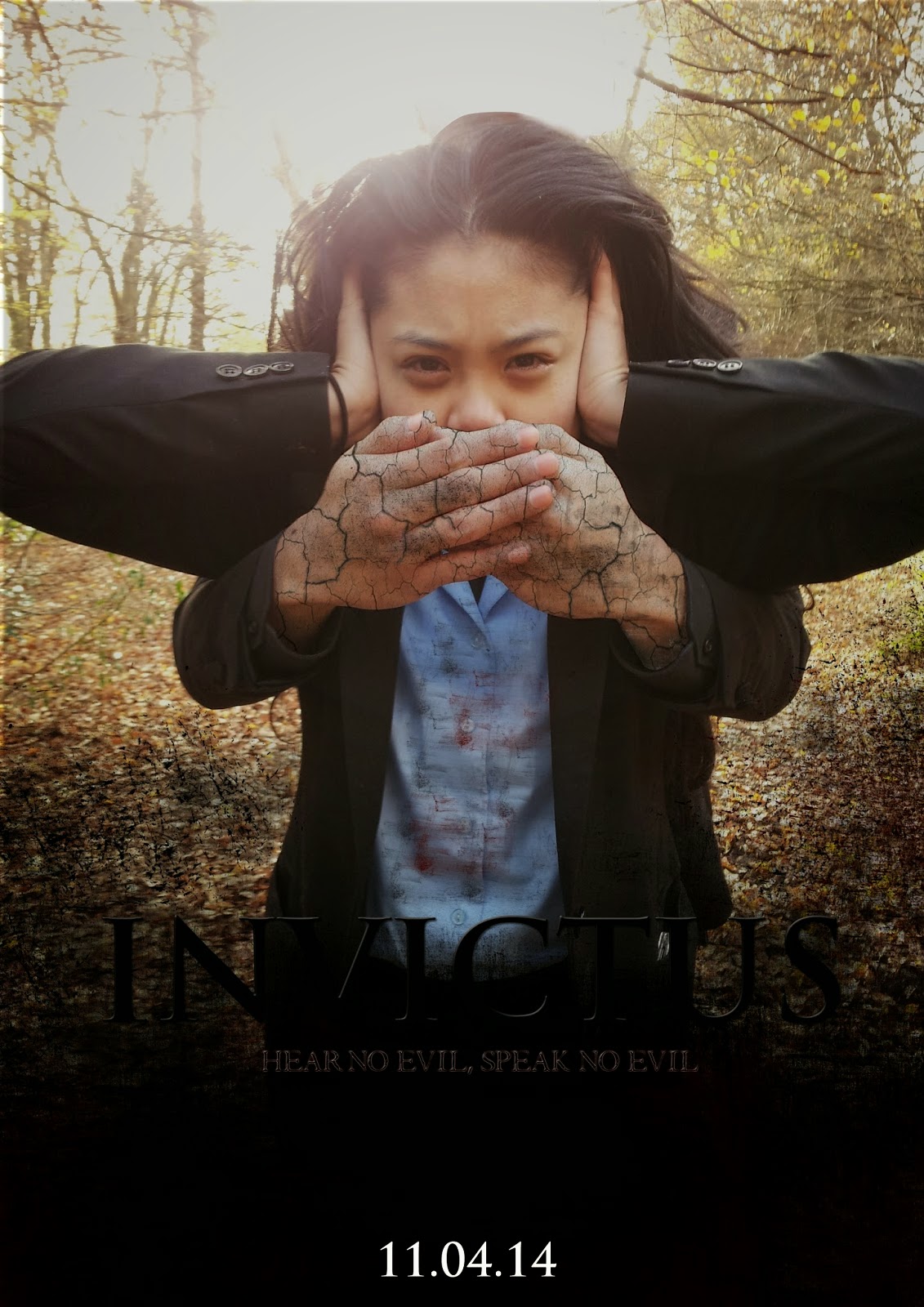
Final Film Poster
+draft+3.jpg)
On the left where it says "Hear no evil", Valentino has edited the crackling effect on the side of the protagonist's face, near her ear to emphasise the word "hear" and the action of its property. On the right where it says "Speak no Evil", he has edited the crackling effect near her mouth to emphasis the word "speak" and notion of speech.
We decided to use the effect of cracks to show the corruption of the protagonist's character when she becomes possessed. The cracks near her ear represents the demon's influence on her mind that control her actions. She can only listen to the demon in the state of possession due to it's power and it being unbeatable - hence the title "INVICTUS" which is Latin for "unconquered / unconquerable / unbeatable".
The cracks near her mouth represents the corruption of the protagonists speech. Her own speech has been restricted by the demon who has possessed her. Instead, she begins to sing nursery rhymes in a creepy and unsettling way.
Choosing our Final Film Potser
+draft+3.jpg)

"I think they're both really good. I like the crackling effect you used on both of them but I do prefer the one with the protagonist facing herself. It seems more creepy, also more professional."
- Deborah, 19
"The contrast of black a white are really effective. I think the tones of grey make it seem more haunting. I like how the title is placed vertically in the centre which gives a mirror effect to the two images.
As for the other other one, I like how the background image is of the forest and the awesome editing that was probably used to create the image of hands coming out from nowhere. It almost gives you a 3D effect."
- Leola, 49
Evaluation Question #1
How did you use media technologies in the construction, research and planning and evaluation stages?
Thursday 24 April 2014

Wednesday 23 April 2014
Audience Feedback - Poster and Magazine Drafts
After taking a look at our drafts for our film magazine and poster, we asked one of our classmates their thoughts and feelings on our products.
Choosing our Final Magazine
When we created the first drafts of the film poster and the independent film magazine we had a problem with bother of them have a too similar image.


To solve this problem, we conducted another photo shoot with the main protagonist to get more photos so that we can have different pictures between the poster and the magazine. Here is the outcome of this decision:

To solve this problem, we conducted another photo shoot with the main protagonist to get more photos so that we can have different pictures between the poster and the magazine. Here is the outcome of this decision:
Monday 21 April 2014
Invictus - Final Trailer (Feedback)
Our final draft of the teaser trailer was shown to a group of year 10 media students. They then wrote their thoughts about our trailer down on a post-it note saying whether they liked the trailer or not or on how we could of improved on it. We had an equal amount of positive and negative comments but most of the comments where similar which made the improvements obvious. This is some of their feedback;
Joshua, 14 - "INVICTUS, it was quite intriguing and the
sound effects was very good."
Anonymous - "Good sound effects"
"Good Tension"
"The Audio is good for the genre, the part where he runs, screaming makes it look like a comedy."
"Really good music which shows the suspense/drama. Change the speed of which the text follows through."
"The use of non-diegetic music to create tension was good. However, the sounds should be more dramatic at the end."
"Good use of sound, Improve camera angles."
"Too comic, confusing story line."
As we can see, most of the comments that we received compliments on the sound concept of our trailer clearly being a very strong aspect and having a very positive effect on out trailer.
We also had a few very helpful comments on certain scenes that we can improve on, e.g. "...the part where he runs, screaming makes it look like a comedy." We have taken this certain comment into consideration as it has been a popular comment when our trailer is shown to viewers and have decided to shorten this certain scene rather than completely cut the whole running scene from the trailer as we believe that that we are able still work with a bit of comedy within the trailer.
Sunday 20 April 2014
Friday 4 April 2014

Tuesday 1 April 2014
Construction of cracks
1.
I searched for the appropriate image to use on Google. I then placed the image onto the area that I wanted to crack.
2.

I then changed the image from 'normal' to 'multiply' in order for the image to appear transparent.
3.
I then changed the opacity from 100% to about 60% to make the image transparent further.
5. 
I then changed the darkness and brightness levels by pressing 'Ctrl + L'. This was so I could precisely ensure that it is darker in specific parts of the cracks, this is also to make the cracks look more natural and not manipulated in.
6. 
Here is where I added a vector mask to the image so that when I erase the unwanted parts of the cracks the edges are well-defined, clean and smooth, this is to also ensure that the edges are not jagged.
7.
I then went around the image to removed the unwanted cracks, another alternative would of been to right click the layer and create a clipping mask.
8.

The final step was to select the burn tool, in which I went over some cracks to darken the effect and make it look realistic. The cracks connotes to the our genre of horror and would be a typical ideology of horror, using this effect would also attract our target audience.
Development of Poster
First Draft:

This being this being the first draft of our poster, I had to manipulate and cut out the guy in the back in order for the poster to make sense. In which I used the pen tool to go around him, made a selection and cut him out. To ensure there were no harsh lines, I used to blur tool to make the cuts look more realistic. I then played around with a lot of the filters to dark the natural brightness of the picture. The idea was to darken the entire picture without making it look too filtered.
Second Draft:
Here is where I added titles and other basic conventions of a film poster. I also added a crack effect to the hands that is covering the actors mouth to make it look more creepy and broken. I found a cracked picture on Google, I then copied this onto the Photoshop document where I changed the image from 'normal' to 'multiply', I then positioned the cracks onto the hands and changed the opacity to about 60%. I further edited the cracks by pressing 'Ctrl + L' to changed the brightness and darkness levels of the cracks. I then had to add a vector mask to the cracks layer in order to cut out the unwanted cracks. Once the cracks were in place and looked okay I used the burn tool in some of the cracks to make the cracks look more natural. For the titles I used the font 'Trojan Pro' in which the colors appeared to be dark so this needed to be changed.
Third Draft:

This is where I added more titles, it's important for us to use all basic conventions in order for the poster to look as realistic as possible. I also added another layer which darkened the poster. Despite changed the titles from black to red they still appeared to look dark which needed changing as from audience feedback 70% of people said it was difficult to read and see.
Final Poster:

For the final draft I made the titles a lot brighter and also added the production companies icons. I also added a slight vignette just to darken the poster further.
Subscribe to:
Posts
(
Atom
)